I did a series of these in the opposite, corresponding colors. Green instead of red, etc. I like how the basic image is there, but different things can be said through the abstract treatment of the elements.
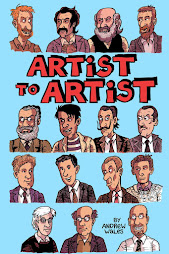
Click on the image above to order your very own copy from this online store!
Print on Demand Services
This is a great printing service if you want to print your own comic.
Things that Make you go Hmm...
"People who cannot recognize a palpable absurdity are very much in the way of civilization" Agnes Repplier
“Imagination continually frustrates tradition; that is its function” -Jules Pfeiffer
“Conformity is the jailer of freedom and the enemy of growth.” ~John F. Kennedy
“To be yourself in a world that is constantly trying to make you something else is the greatest accomplishment.” -Ralph Waldo Emerson
"The creation of something new is not accomplished by the intellect, but by the play instinct -- acting from inner necessity. The creative mind plays with the objects it loves." -Carl Jung
 I did a series of these in the opposite, corresponding colors. Green instead of red, etc. I like how the basic image is there, but different things can be said through the abstract treatment of the elements.


1 comment:
These turned out so great!
Post a Comment